

…are seeing considerable declines in rural populations. Significant rural population increases, by contrast, are mostly concentrated in those countries that have rural populations of over 50 per cent. Migration into…

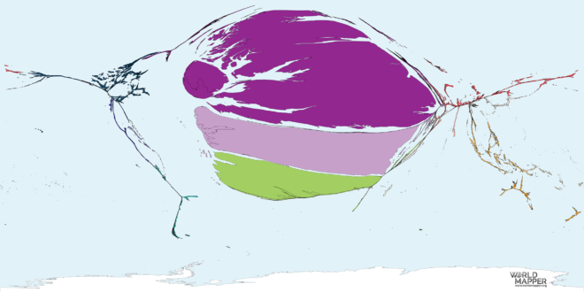
This map shows the countries of origin proportional to the number of people who were migrants to Brazil. Data sources This map uses data United Nations Population Division, Department of…

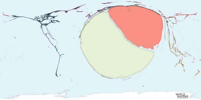
This map shows the countries of origin proportional to the number of people who were migrants to China. Data sources This map uses data United Nations Population Division, Department of…

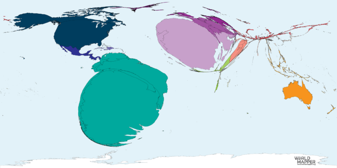
This map shows the countries of origin proportional to the number of people who were migrants to Canada in the period from 1990 to 2017. Data sources This map uses…

This map shows the countries of origin proportional to the number of people who were migrants to Argentina in the period 1990 to 2017. Data sources This map uses data…

This map shows the countries of origin proportional to the number of people who were migrants to Saudi Arabia. Data sources This map uses data United Nations Population Division, Department…

This map shows the countries of origin proportional to the number of people who were migrants to Austria in the period 1990 to 2017. Data sources This map uses data…

This map shows the countries of origin proportional to the number of people who were migrants to Belgium in the period 1990 to 2017. Data sources This map uses data…

This map shows the countries of origin proportional to the number of people who were migrants to Estonia in the period 1990 to 2017. Data sources This map uses data…

This map shows the countries of origin proportional to the number of people who were migrants to Bulgaria in the period 1990 to 2017. Data sources This map uses data…

This map shows the countries of origin proportional to the number of people who were migrants to Croatia in the period 1990 to 2017. Data sources This map uses data…

This map shows the countries of origin proportional to the number of people who were migrants to Czechia in the period 1990 to 2017. Data sources This map uses data…

This map shows the countries of origin proportional to the number of people who were migrants to Finland in the period 1990 to 2017. Data sources This map uses data…
This map shows the countries of origin proportional to the number of people who were migrants to Gibraltar in the period 1990 to 2017. Data sources This map uses data…

This map shows the countries of origin proportional to the number of people who were migrants to Greenland in the period 1990 to 2017. Data sources This map uses data…

This map shows the countries of origin proportional to the number of people who were migrants to Spain in the period 1990 to 2017. Data sources This map uses data…

This map shows the countries of origin proportional to the number of people who were migrants to Albania in the period 1990 to 2017. Data sources This map uses data…

This map shows the countries of origin proportional to the number of people who were migrants to Bosnia and Herzegovina in the period 1990 to 2017. Data sources This map…

This map shows the countries of origin proportional to the number of people who were migrants to Belarus in the period 1990 to 2017. Data sources This map uses data…

This map shows the countries of origin proportional to the number of people who were migrants to Bangladesh in the period 1990 to 2017. Data sources This map uses data…
This map shows the countries of origin proportional to the number of people who were migrants to Somalia in the period 1990 to 2017. Data sources This map uses data…

This map shows the countries of origin proportional to the number of people who were migrants to Sri Lanka in the period 1990 to 2017. Data sources This map uses…
This map shows the countries of destination proportional to the number of people who were migrants from Syria in the period 1990 to 2017. Data sources This map uses data…

This map shows the countries of destination proportional to the number of people who were migrants from Venezuela in the period 1990 to 2017. Data sources This map uses data…

This map shows the countries of destination proportional to the number of people who were migrants from North Korea in the period 1990 to 2017. Data sources This map uses…

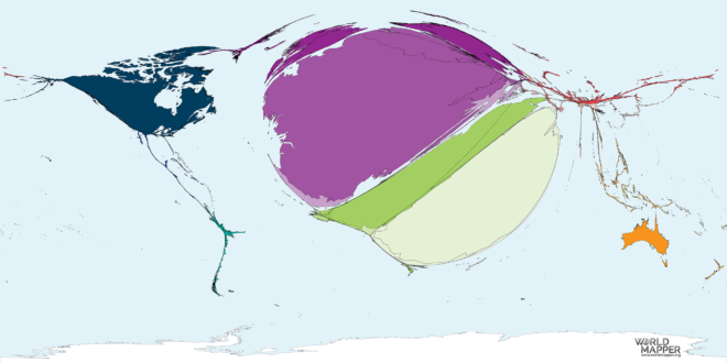
This map shows the countries of origin proportional to the number of people who were migrants to Australia in the period from 1990 to 2017. Data sources This map uses…

This map shows the countries of origin proportional to the number of people who were migrants to Hungary in the period 1990 to 2017. Data sources This map uses data…

This map shows the countries of destination proportional to the number of people who were migrants from Belarus in the period 1990 to 2017. The colour shading indicates the major…

This map shows the countries of destination proportional to the number of people who were migrants from Afghanistan in the period 1990 to 2017. Data sources This map uses data…

This map shows the countries of destination proportional to the number of people who were migrants to Afghanistan in the period 1990 to 2017. Data sources This map uses data…

This map shows the countries of destination proportional to the number of people who were migrants from Bosnia and Herzegovina in the period 1990 to 2017. Data sources This map…
This map shows the countries of destination proportional to the number of people who were migrants to Iran in the period 1990 to 2017. Data sources This map uses data…

This map shows the countries of origin proportional to the number of people who were migrants from Albania in the period 1990 to 2017. Data sources This map uses data…

This map shows the countries of destination proportional to the number of people who were migrants from Algeria in the period 1990 to 2017. Data sources This map uses data…

This map shows the countries of destination proportional to the number of people who were migrants to Algeria in the period 1990 to 2017. Data sources This map uses data…

This map shows the countries of destination proportional to the number of people who were migrants to Angola in the period 1990 to 2017. The colour shading indicates the major…

This map shows the countries of destination proportional to the number of people who were migrants from Angola in the period 1990 to 2017. Data sources This map uses data…

This map shows the countries of origin proportional to the number of people who were migrants from Armenia. The colour shading indicates the major geographic regions of the world used…

This map shows the countries of origin proportional to the number of people who were migrants to Armenia. Data sources This map uses data United Nations Population Division, Department of…

This map shows the countries of origin proportional to the number of people who were migrants from Argentina in the period 1990 to 2017. Data sources This map uses data…

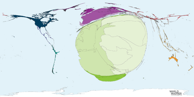
This map shows the countries of origin proportional to the number of people who were migrants from Australia in the period from 1990 to 2017. Data sources This map uses…

This map shows the countries of origin proportional to the number of people who were migrants from Austria in the period 1990 to 2017. Data sources This map uses data…

This map shows the countries of origin proportional to the number of people who were migrants from Azerbaijan. Data sources This map uses data United Nations Population Division, Department of…

This map shows the countries of origin proportional to the number of people who were migrants to Azerbaijan. Data sources This map uses data United Nations Population Division, Department of…

This map shows the countries of origin proportional to the number of people who were migrants from Bahrain in the period from 1990 to 2017. Data sources This map uses…
This map shows the countries of origin proportional to the number of people who were migrants to Bahrain in the period from 1990 to 2017. Data sources This map uses…

This map shows the countries of origin proportional to the number of people who were migrants from Belize in the period 1990 to 2017. Data sources This map uses data…

This map shows the countries of origin proportional to the number of people who were migrants to Belgium in the period 1990 to 2017. Data sources This map uses data…

This map shows the countries of origin proportional to the number of people who were migrants to Belize in the period 1990 to 2017. Data sources This map uses data…

This map shows the countries of origin proportional to the number of people who were migrants to Benin the period 1990 to 2017. Data sources This map uses data United…

This map shows the countries of origin proportional to the number of people who were migrants from Benin the period 1990 to 2017. Data sources This map uses data United…

This map shows the countries of destination proportional to the number of people who were migrants to Bhutan in the period 1990 to 2017. Data sources This map uses data…

This map shows the countries of destination proportional to the number of people who were migrants from Bhutan in the period 1990 to 2017. The colour shading indicates the major…

This map shows the countries of destination proportional to the number of people who were migrants to Bolivia in the period 1990 to 2017. Data sources This map uses data…

This map shows the countries of destination proportional to the number of people who were migrants to Bolivia in the period 1990 to 2017. Data sources This map uses data…
This map shows the countries of destination proportional to the number of people who were migrants from Botswana in the period 1990 to 2017. Data sources This map uses data…

This map shows the countries of destination proportional to the number of people who were migrants to Botswana in the period 1990 to 2017. Data sources This map uses data…

This map shows the countries of destination proportional to the number of people who were migrants to Brunei in the period 1990 to 2017. Data sources This map uses data…
This map shows the countries of destination proportional to the number of people who were migrants to Burkina Faso in the period 1990 to 2017. Data sources This map uses…

This map shows the countries of destination proportional to the number of people who were migrants to Burundi in the period 1990 to 2017. The colour shading indicates the major…

This map shows the countries of destination proportional to the number of people who were migrants to Cape Verde in the period 1990 to 2017. The colour shading indicates the…

This map shows the countries of destination proportional to the number of people who were migrants to Cambodia in the period 1990 to 2017. Data sources This map uses data…

This map shows the countries of destination proportional to the number of people who were migrants to Cameroon in the period 1990 to 2017. Data sources This map uses data…

This map shows the countries of destination proportional to the number of people who were migrants to Central African Republic in the period 1990 to 2017. Data sources This map…

This map shows the countries of destination proportional to the number of people who were migrants to Chad in the period 1990 to 2017. Data sources This map uses data…

This map shows the countries of destination proportional to the number of people who were migrants to Chile in the period 1990 to 2017. Data sources This map uses data…

This map shows the countries of destination proportional to the number of people who were migrants to Colombia in the period 1990 to 2017. The colour shading indicates the major…

This map shows the countries of destination proportional to the number of people who were migrants to Costa Rica in the period 1990 to 2017. Data sources This map uses…

This map shows the countries of destination proportional to the number of people who were migrants to Republic of Congo in the period 1990 to 2017. Data sources This map…

This map shows the countries of destination proportional to the number of people who were migrants to Cuba in the period 1990 to 2017. The colour shading indicates the major…

This map shows the countries of destination proportional to the number of people who were migrants to Cyprus in the period 1990 to 2017. Data sources This map uses data…

This map shows the countries of destination proportional to the number of people who were migrants to Djibouti in the period 1990 to 2017. Data sources This map uses data…

This map shows the countries of destination proportional to the number of people who were migrants to Dominican Republic in the period 1990 to 2017. Data sources This map uses…

This map shows the countries of destination proportional to the number of people who were migrants to East Timor in the period 1990 to 2017. Data sources This map uses…

This map shows the countries of destination proportional to the number of people who were migrants to Ecuador in the period 1990 to 2017. Data sources This map uses data…

This map shows the countries of destination proportional to the number of people who were migrants to Dominica in the period 1990 to 2017. The colour shading indicates the major…

This map shows the countries of destination proportional to the number of people who were migrants to Egypt in the period 1990 to 2017. Data sources This map uses data…

This map shows the countries of destination proportional to the number of people who were migrants to El Salvador in the period 1990 to 2017. Data sources This map uses…

This map shows the countries of destination proportional to the number of people who were migrants to Eritrea in the period 1990 to 2017. Data sources This map uses data…
This map shows the countries of destination proportional to the number of people who were migrants to Ethiopia in the period 1990 to 2017. Data sources This map uses data…

This map shows the countries of destination proportional to the number of people who were migrants to Fiji in the period 1990 to 2017. Data sources This map uses data…

This map shows the countries of destination proportional to the number of people who were migrants to Gabon in the period 1990 to 2017. Data sources This map uses data…

This map shows the countries of destination proportional to the number of people who were migrants to French Guiana in the period 1990 to 2017. Data sources This map uses…

This map shows the countries of destination proportional to the number of people who were migrants to Georgia in the period 1990 to 2017. Data sources This map uses data…

This map shows the countries of destination proportional to the number of people who were migrants to Gambia in the period 1990 to 2017. Data sources This map uses data…

This map shows the countries of destination proportional to the number of people who were migrants to Faroe Islands in the period 1990 to 2017. Data sources This map uses…

This map shows the countries of destination proportional to the number of people who were migrants to French Polynesia in the period 1990 to 2017. Data sources This map uses…

This map shows the countries of destination proportional to the number of people who were migrants to Ghana in the period 1990 to 2017. Data sources This map uses data…

This map shows the countries of destination proportional to the number of people who were migrants to Grenada in the period 1990 to 2017. Data sources This map uses data…

This map shows the countries of destination proportional to the number of people who were migrants to Guatemala in the period 1990 to 2017. Data sources This map uses data…

This map shows the countries of destination proportional to the number of people who were migrants to Guinea in the period 1990 to 2017. The colour shading indicates the major…

This map shows the countries of destination proportional to the number of people who were migrants to Guinea-Bissau in the period 1990 to 2017. Data sources This map uses data…

This map shows the countries of destination proportional to the number of people who were migrants to Guyana in the period 1990 to 2017. Data sources This map uses data…

This map shows the countries of destination proportional to the number of people who were migrants to Honduras in the period 1990 to 2017. Data sources This map uses data…

This map shows the countries of destination proportional to the number of people who were migrants to Guadeloupe in the period 1990 to 2017. Data sources This map uses data…

This map shows the countries of destination proportional to the number of people who were migrants to Guam in the period 1990 to 2017. Data sources This map uses data…

This map shows the countries of destination proportional to the number of people who were migrants to Hong Kong in the period 1990 to 2017. The colour shading indicates the…

This map shows the countries of destination proportional to the number of people who were migrants to The Bahamas in the period 1990 to 2017. Data sources This map uses…

This map shows the countries of destination proportional to the number of people who were migrants to Iraq in the period 1990 to 2017. Data sources This map uses data…

This map shows the countries of destination proportional to the number of people who were migrants to Ivory Coast in the period 1990 to 2017. Data sources This map uses…

This map shows the countries of destination proportional to the number of people who were migrants to Jamaica in the period 1990 to 2017. Data sources This map uses data…
This map shows the countries of destination proportional to the number of people who were migrants to Jordan in the period 1990 to 2017. Data sources This map uses data…

This map shows the countries of destination proportional to the number of people who were migrants to Kazakhstan in the period 1990 to 2017. Data sources This map uses data…
This map shows the countries of destination proportional to the number of people who were migrants to Kenya in the period 1990 to 2017. Data sources This map uses data…

This map shows the countries of destination proportional to the number of people who were migrants to Kuwait in the period 1990 to 2017. Data sources This map uses data…

This map shows the countries of destination proportional to the number of people who were migrants to Kyrgyzstan in the period 1990 to 2017. Data sources This map uses data…

This map shows the countries of destination proportional to the number of people who were migrants to Laos in the period 1990 to 2017. The colour shading indicates the major…

This map shows the countries of destination proportional to the number of people who were migrants to Lesotho in the period 1990 to 2017. The colour shading indicates the major…

This map shows the countries of destination proportional to the number of people who were migrants to Liberia in the period 1990 to 2017. Data sources This map uses data…

This map shows the countries of destination proportional to the number of people who were migrants to Libya in the period 1990 to 2017. Data sources This map uses data…

This map shows the countries of destination proportional to the number of people who were migrants to Macao in the period 1990 to 2017. Data sources This map uses data…

This map shows the countries of destination proportional to the number of people who were migrants to Malawi in the period 1990 to 2017. The colour shading indicates the major…

This map shows the countries of destination proportional to the number of people who were migrants to Malaysia in the period 1990 to 2017. Data sources This map uses data…

This map shows the countries of destination proportional to the number of people who were migrants to Mali in the period 1990 to 2017. Data sources This map uses data…

This map shows the countries of destination proportional to the number of people who were migrants to Mauritania in the period 1990 to 2017. Data sources This map uses data…
This map shows the countries of destination proportional to the number of people who were migrants to Mongolia in the period 1990 to 2017. The colour shading indicates the major…

This map shows the countries of destination proportional to the number of people who were migrants to Morocco in the period 1990 to 2017. Data sources This map uses data…

This map shows the countries of destination proportional to the number of people who were migrants to Mozambique in the period 1990 to 2017. Data sources This map uses data…
This map shows the countries of destination proportional to the number of people who were migrants to Myanmar in the period 1990 to 2017. The colour shading indicates the major…

This map shows the countries of destination proportional to the number of people who were migrants to Namibia in the period 1990 to 2017. The colour shading indicates the major…

This map shows the countries of destination proportional to the number of people who were migrants to New Zealand in the period 1990 to 2017. The colour shading indicates the…

This map shows the countries of destination proportional to the number of people who were migrants to Nicaragua in the period 1990 to 2017. The colour shading indicates the major…

This map shows the countries of destination proportional to the number of people who were migrants to Niger in the period 1990 to 2017. Data sources This map uses data…

This map shows the countries of destination proportional to the number of people who were migrants to Nigeria in the period 1990 to 2017. The colour shading indicates the major…

This map shows the countries of destination proportional to the number of people who were migrants to Oman in the period 1990 to 2017. Data sources This map uses data…

This map shows the countries of destination proportional to the number of people who were migrants from North Korea in the period 1990 to 2017. Data sources This map uses…

This map shows the countries of destination proportional to the number of people who were migrants to Pakistan in the period 1990 to 2017. Data sources This map uses data…

This map shows the countries of destination proportional to the number of people who were migrants to Panama in the period 1990 to 2017. The colour shading indicates the major…

This map shows the countries of destination proportional to the number of people who were migrants to Palestine in the period 1990 to 2017. Data sources This map uses data…

This map shows the countries of destination proportional to the number of people who were migrants to Papua New Guinea in the period 1990 to 2017. The colour shading indicates…

This map shows the countries of destination proportional to the number of people who were migrants to Paraguay in the period 1990 to 2017. The colour shading indicates the major…

This map shows the countries of destination proportional to the number of people who were migrants to Peru in the period 1990 to 2017. Data sources This map uses data…

This map shows the countries of destination proportional to the number of people who were migrants to Philippines in the period 1990 to 2017. The colour shading indicates the major…

This map shows the countries of destination proportional to the number of people who were migrants to Puerto Rico in the period 1990 to 2017. The colour shading indicates the…
This map shows the countries of destination proportional to the number of people who were migrants to Qatar in the period 1990 to 2017. Data sources This map uses data…

This map shows the countries of destination proportional to the number of people who were migrants to Rwanda in the period 1990 to 2017. Data sources This map uses data…

This map shows the countries of destination proportional to the number of people who were migrants to Senegal in the period 1990 to 2017. Data sources This map uses data…

This map shows the countries of destination proportional to the number of people who were migrants to Sierra Leone in the period 1990 to 2017. Data sources This map uses…
This map shows the countries of destination proportional to the number of people who were migrants to Singapore in the period 1990 to 2017. The colour shading indicates the major…

This map shows the countries of origin proportional to the number of people who were migrants to South Sudan in the period 1990 to 2017. Data sources This map uses…

This map shows the countries of destination proportional to the number of people who were migrants to Suriname in the period 1990 to 2017. Data sources This map uses data…

This map shows the countries of destination proportional to the number of people who were migrants to Swaziland in the period 1990 to 2017. Data sources This map uses data…

This map shows the countries of destination proportional to the number of people who were migrants to Syria in the period 1990 to 2017. Data sources This map uses data…

This map shows the countries of destination proportional to the number of people who were migrants to Tanzania in the period 1990 to 2017. The colour shading indicates the major…

This map shows the countries of destination proportional to the number of people who were migrants to Tajikistan in the period 1990 to 2017. Data sources This map uses data…

This map shows the countries of destination proportional to the number of people who were migrants to Thailand in the period 1990 to 2017. The colour shading indicates the major…
This map shows the countries of destination proportional to the number of people who were migrants to Togo in the period 1990 to 2017. Data sources This map uses data…

This map shows the countries of destination proportional to the number of people who were migrants to Uganda in the period 1990 to 2017. Data sources This map uses data…

This map shows the countries of destination proportional to the number of people who were migrants to United Arab Emirates in the period 1990 to 2017. The colour shading indicates…

This map shows the countries of destination proportional to the number of people who were migrants to Uruguay in the period 1990 to 2017. Data sources This map uses data…

This map shows the countries of destination proportional to the number of people who were migrants to Uzbekistan in the period 1990 to 2017. Data sources This map uses data…
This map shows the countries of destination proportional to the number of people who were migrants to Venezuela in the period 1990 to 2017. Data sources This map uses data…

This map shows the countries of destination proportional to the number of people who were migrants to Vietnam in the period 1990 to 2017. Data sources This map uses data…

This map shows the countries of destination proportional to the number of people who were migrants to Western Sahara in the period 1990 to 2017. Data sources This map uses…
This map shows the countries of destination proportional to the number of people who were migrants to Yemen in the period 1990 to 2017. Data sources This map uses data…

This map shows the countries of destination proportional to the number of people who were migrants to Zambia in the period 1990 to 2017. Data sources This map uses data…

This map shows the countries of origin proportional to the number of people who were migrants to the United Kingdom. Data sources This map uses data United Nations Population Division,…

This map shows the countries of origin proportional to the number of people who were migrants to Bangladesh in the period 1990 to 2017. The colour shading indicates the major…

This map shows the countries of destination proportional to the number of people who were migrants from United Kingdom in the period 1990 to 2017. The colour shading indicates the…

This map shows the countries of destination proportional to the number of people who were migrants to Lebanon in the period 1990 to 2017. The colour shading indicates the major…

This map shows the countries of origin proportional to the number of people who were migrants to Brazil. Data sources This map uses data United Nations Population Division, Department of…

This map shows the countries of origin proportional to the number of people who were migrants to Bulgaria in the period 1990 to 2017. Data sources This map uses data…

This map shows the countries of destination proportional to the number of people who were migrants from Brunei in the period 1990 to 2017. Data sources This map uses data…

This map shows the countries of destination proportional to the number of people who were migrants from Burkina Faso in the period 1990 to 2017. Data sources This map uses…

This map shows the countries of destination proportional to the number of people who were migrants from Burundi in the period 1990 to 2017. Data sources This map uses data…

This map shows the countries of destination proportional to the number of people who were migrants from Cambodia in the period 1990 to 2017. Data sources This map uses data…
This map shows the countries of destination proportional to the number of people who were migrants from Cameroon in the period 1990 to 2017. Data sources This map uses data…

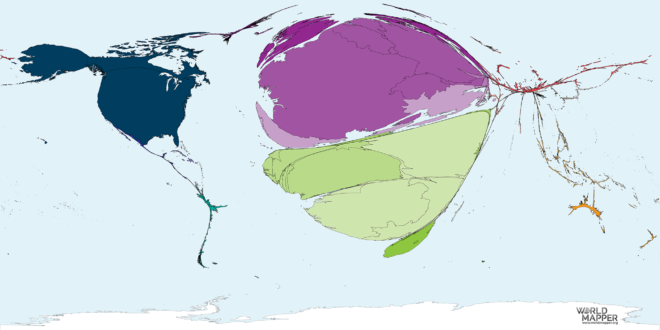
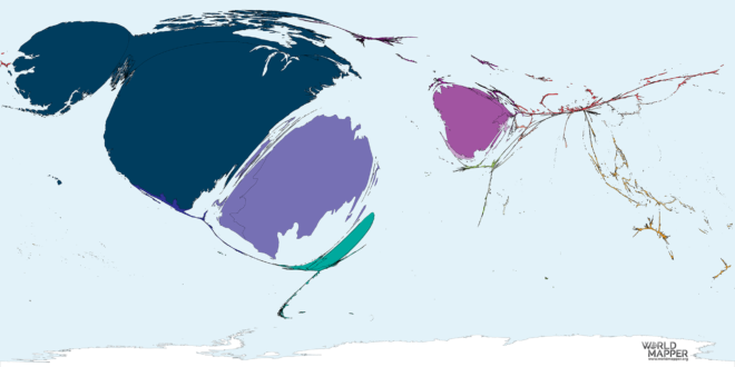
This map shows the countries of origin proportional to the number of people who were migrants from Canada in the period from 1990 to 2017. The colour shading indicates the…

This map shows the countries of destination proportional to the number of people who were migrants from Cape Verde in the period 1990 to 2017. Data sources This map uses…

This map shows the countries of destination proportional to the number of people who were migrants from Central African Republic in the period 1990 to 2017. Data sources This map…

This map shows the countries of destination proportional to the number of people who were migrants from Chad in the period 1990 to 2017. Data sources This map uses data…

This map shows the countries of destination proportional to the number of people who were migrants from Chile in the period 1990 to 2017. Data sources This map uses data…

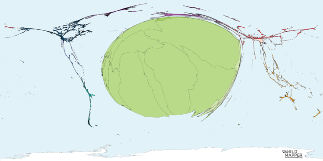
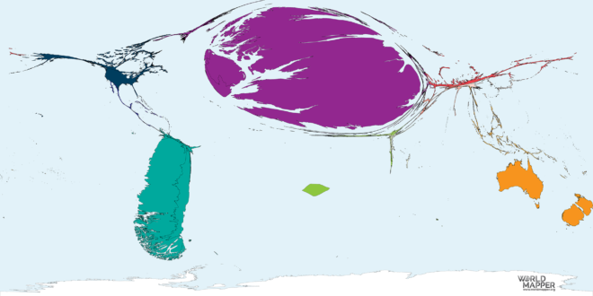
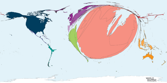
This map shows the countries of origin proportional to the number of people who were migrants from China in the period 1990 to 2017. Data sources This map uses data…

This map shows the countries of destination proportional to the number of people who were migrants from Colombia in the period 1990 to 2017. Data sources This map uses data…

This map shows the countries of destination proportional to the number of people who were migrants from Republic of Congo in the period 1990 to 2017. Data sources This map…

This map shows the countries of destination proportional to the number of people who were migrants from Costa Rica in the period 1990 to 2017. Data sources This map uses…

This map shows the countries of origin proportional to the number of people who were migrants from Croatia in the period 1990 to 2017. Data sources This map uses data…

This map shows the countries of destination proportional to the number of people who were migrants from Cuba in the period 1990 to 2017. The colour shading indicates the major…

This map shows the countries of destination proportional to the number of people who were migrants from Cyprus in the period 1990 to 2017. Data sources This map uses data…

This map shows the countries of origin proportional to the number of people who were migrants from Czechia in the period 1990 to 2017. Data sources This map uses data…
This map shows the countries of destination proportional to the number of people who were migrants from Democratic Republic of Congo in the period 1990 to 2017. Data sources This…

This map shows the countries of origin proportional to the number of people who were migrants from Denmark in the period 1990 to 2017. Data sources This map uses data…
This map shows the countries of destination proportional to the number of people who were migrants from Djibouti in the period 1990 to 2017. The colour shading indicates the major…

This map shows the countries of origin proportional to the number of people who were migrants to Denmark in the period 1990 to 2017. Data sources This map uses data…

This map shows the countries of destination proportional to the number of people who were migrants from Dominica in the period 1990 to 2017. Data sources This map uses data…

This map shows the countries of destination proportional to the number of people who were migrants from Dominican Republic in the period 1990 to 2017. Data sources This map uses…

This map shows the countries of destination proportional to the number of people who were migrants from Ecuador in the period 1990 to 2017. Data sources This map uses data…

This map shows the countries of destination proportional to the number of people who were migrants from Egypt in the period 1990 to 2017. Data sources This map uses data…

This map shows the countries of destination proportional to the number of people who were migrants from El Salvador in the period 1990 to 2017. Data sources This map uses…
This map shows the countries of destination proportional to the number of people who were migrants to Equatorial Guinea in the period 1990 to 2017. Data sources This map uses…

This map shows the countries of destination proportional to the number of people who were migrants from Equatorial Guinea in the period 1990 to 2017. Data sources This map uses…

This map shows the countries of destination proportional to the number of people who were migrants from Eritrea in the period 1990 to 2017. Data sources This map uses data…

This map shows the countries of origin proportional to the number of people who were migrants from Estonia in the period 1990 to 2017. The colour shading indicates the major…

This map shows the countries of destination proportional to the number of people who were migrants from Ethiopia in the period 1990 to 2017. Data sources This map uses data…

This map shows the countries of destination proportional to the number of people who were migrants from Falkland Islands in the period 1990 to 2017. Data sources This map uses…
This map shows the countries of destination proportional to the number of people who were migrants to Falkland Islands in the period 1990 to 2017. Data sources This map uses…

This map shows the countries of destination proportional to the number of people who were migrants from Faroe Islands in the period 1990 to 2017. Data sources This map uses…

This map shows the countries of destination proportional to the number of people who were migrants from Fiji in the period 1990 to 2017. Data sources This map uses data…

This map shows the countries of origin proportional to the number of people who were migrants to Finland in the period 1990 to 2017. Data sources This map uses data…

This map shows the countries of origin proportional to the number of people who were migrants to France in the period from 1990 to 2017. The colour shading indicates the…

This map shows the countries of origin proportional to the number of people who were migrants to France in the period from 1990 to 2017. Data sources This map uses…

This map shows the countries of destination proportional to the number of people who were migrants from French Polynesia in the period 1990 to 2017. Data sources This map uses…

This map shows the countries of destination proportional to the number of people who were migrants from French Guiana in the period 1990 to 2017. Data sources This map uses…

This map shows the countries of destination proportional to the number of people who were migrants from Hong Kong in the period 1990 to 2017. Data sources This map uses…
This map shows the countries of destination proportional to the number of people who were migrants from Ivory Coast in the period 1990 to 2017. Data sources This map uses…

This map shows the countries of destination proportional to the number of people who were migrants from Macao in the period 1990 to 2017. The colour shading indicates the major…

This map shows the countries of destination proportional to the number of people who were migrants from Mauritania in the period 1990 to 2017. Data sources This map uses data…

This map shows the countries of destination proportional to the number of people who were migrants from Gabon in the period 1990 to 2017. The colour shading indicates the major…

This map shows the countries of destination proportional to the number of people who were migrants from Gambia in the period 1990 to 2017. The colour shading indicates the major…

This map shows the countries of destination proportional to the number of people who were migrants from Georgia in the period 1990 to 2017. Data sources This map uses data…

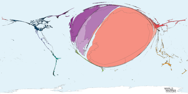
This map shows the countries of origin proportional to the number of people who were migrants from Germany between 1990 and 2017. The colour shading indicates the major geographic regions…

This map shows the countries of origin proportional to the number of people who were migrants to Germany between 1990 and 2017. Data sources This map uses data United Nations…

This map shows the countries of destination proportional to the number of people who were migrants from Ghana in the period 1990 to 2017. Data sources This map uses data…

This map shows the countries of origin proportional to the number of people who were migrants from Gibraltar in the period 1990 to 2017. Data sources This map uses data…

This map shows the countries of origin proportional to the number of people who were migrants from Greece in the period 1990 to 2017. Data sources This map uses data…

This map shows the countries of origin proportional to the number of people who were migrants to Greenland in the period 1990 to 2017. Data sources This map uses data…

This map shows the countries of origin proportional to the number of people who were migrants to Greece in the period 1990 to 2017. The colour shading indicates the major…

This map shows the countries of destination proportional to the number of people who were migrants from Grenada in the period 1990 to 2017. Data sources This map uses data…

This map shows the countries of destination proportional to the number of people who were migrants from Guadeloupe in the period 1990 to 2017. Data sources This map uses data…

This map shows the countries of destination proportional to the number of people who were migrants from Guatemala in the period 1990 to 2017. Data sources This map uses data…

This map shows the countries of destination proportional to the number of people who were migrants from Guinea in the period 1990 to 2017. The colour shading indicates the major…

This map shows the countries of destination proportional to the number of people who were migrants from Guyana in the period 1990 to 2017. Data sources This map uses data…
This map shows the countries of destination proportional to the number of people who were migrants from Haiti in the period 1990 to 2017. The colour shading indicates the major…

This map shows the countries of destination proportional to the number of people who were migrants from Honduras in the period 1990 to 2017. Data sources This map uses data…
This map shows the countries of origin proportional to the number of people who were migrants from Hungary in the period 1990 to 2017. Data sources This map uses data…

This map shows the countries of origin proportional to the number of people who were migrants to Iceland in the period 1990 to 2017. The colour shading indicates the major…

This map shows the countries of origin proportional to the number of people who were migrants to Iceland in the period 1990 to 2017. Data sources This map uses data…

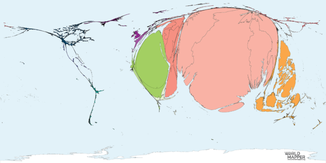
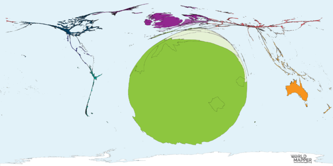
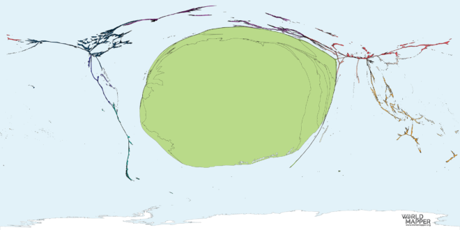
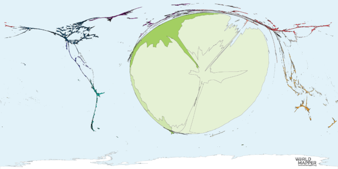
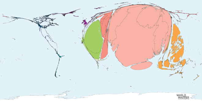
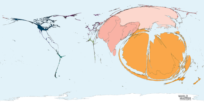
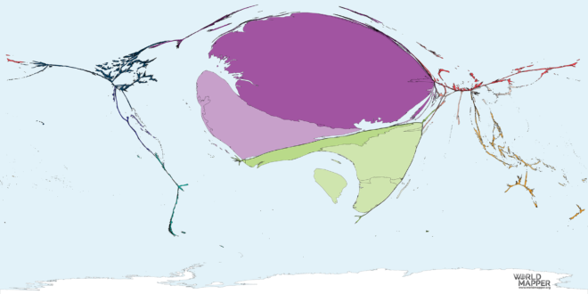
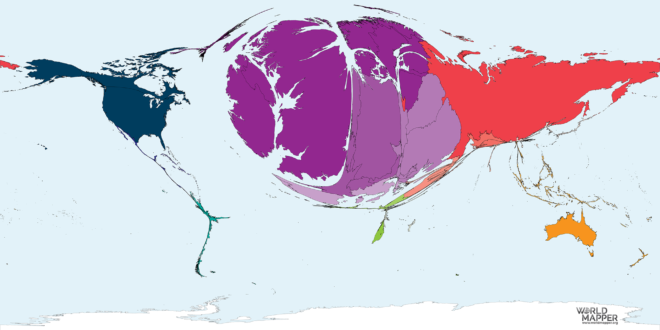
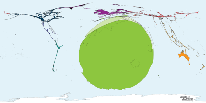
This map shows the countries of origin proportional to the number of people who were migrants to India. Data sources This map uses data United Nations Population Division, Department of…

This map shows the countries of origin proportional to the number of people who were migrants from India. Data sources This map uses data United Nations Population Division, Department of…

This map shows the countries of origin proportional to the number of people who were migrants to Indonesia between 1990 and 2017. Data sources This map uses data United Nations…

This map shows the countries of origin proportional to the number of people who were migrants to Indonesia between 1990 and 2017. Data sources This map uses data United Nations…

This map shows the countries of destination proportional to the number of people who were migrants from Iran in the period 1990 to 2017. Data sources This map uses data…

This map shows the countries of destination proportional to the number of people who were migrants from Iraq in the period 1990 to 2017. Data sources This map uses data…

This map shows the countries of origin proportional to the number of people who were migrants to Ireland in the period 1990 to 2017. Data sources This map uses data…

This map shows the countries of destination proportional to the number of people who were migrants to Israel in the period 1990 to 2017. The colour shading indicates the major…

This map shows the countries of origin proportional to the number of people who were migrants from Ireland in the period 1990 to 2017. Data sources This map uses data…

This map shows the countries of destination proportional to the number of people who were migrants from Israel in the period 1990 to 2017. Data sources This map uses data…

This map shows the countries of origin proportional to the number of people who were migrants to Italy in the period from 1990 to 2017. Data sources This map uses…

This map shows the countries of origin proportional to the number of people who were migrants from Italy in the period from 1990 to 2017. The colour shading indicates the…

This map shows the countries of destination proportional to the number of people who were migrants from Jamaica in the period 1990 to 2017. Data sources This map uses data…

This map shows the countries of origin proportional to the number of people who were migrants to Japan. Data sources This map uses data United Nations Population Division, Department of…

This map shows the countries of origin proportional to the number of people who were migrants from Japan. The colour shading indicates the major geographic regions of the world used…
This map shows the countries of destination proportional to the number of people who were migrants from Jordan in the period 1990 to 2017. Data sources This map uses data…

This map shows the countries of destination proportional to the number of people who were migrants from Kazakhstan in the period 1990 to 2017. The colour shading indicates the major…

This map shows the countries of destination proportional to the number of people who were migrants from Kenya in the period 1990 to 2017. Data sources This map uses data…

This map shows the countries of destination proportional to the number of people who were migrants from Kuwait in the period 1990 to 2017. Data sources This map uses data…

This map shows the countries of destination proportional to the number of people who were migrants from Kyrgyzstan in the period 1990 to 2017. Data sources This map uses data…

This map shows the countries of origin proportional to the number of people who were migrants to Latvia in the period 1990 to 2017. Data sources This map uses data…
This map shows the countries of origin proportional to the number of people who were migrants from Latvia in the period 1990 to 2017. Data sources This map uses data…

This map shows the countries of destination proportional to the number of people who were migrants from Laos in the period 1990 to 2017. Data sources This map uses data…
This map shows the countries of destination proportional to the number of people who were migrants from Lebanon in the period 1990 to 2017. Data sources This map uses data…

This map shows the countries of destination proportional to the number of people who were migrants from Lesotho in the period 1990 to 2017. Data sources This map uses data…

This map shows the countries of destination proportional to the number of people who were migrants from Liberia in the period 1990 to 2017. Data sources This map uses data…

This map shows the countries of destination proportional to the number of people who were migrants from Libya in the period 1990 to 2017. Data sources This map uses data…

This map shows the countries of origin proportional to the number of people who were migrants to Liechtenstein in the period 1990 to 2017. Data sources This map uses data…

This map shows the countries of origin proportional to the number of people who were migrants from Liechtenstein in the period 1990 to 2017. Data sources This map uses data…

This map shows the countries of origin proportional to the number of people who were migrants to Lithuania in the period 1990 to 2017. Data sources This map uses data…

This map shows the countries of origin proportional to the number of people who were migrants from Lithuania in the period 1990 to 2017. Data sources This map uses data…

This map shows the countries of origin proportional to the number of people who were migrants to Luxembourg in the period 1990 to 2017. Data sources This map uses data…

This map shows the countries of origin proportional to the number of people who were migrants from Luxembourg in the period 1990 to 2017. The colour shading indicates the major…

This map shows the countries of origin proportional to the number of people who were migrants from Somalia in the period 1990 to 2017. Data sources This map uses data…

This map shows the countries of origin proportional to the number of people who were migrants to Sri Lanka in the period 1990 to 2017. The colour shading indicates the…

This map shows the countries of origin proportional to the number of people who were migrants to Zimbabwe in the period 1990 to 2017. Data sources This map uses data…

This map shows the countries of origin proportional to the number of people who were migrants to Zimbabwe in the period 1990 to 2017. Data sources This map uses data…

This map shows the countries of destination proportional to the number of people who were migrants from Yemen in the period 1990 to 2017. The colour shading indicates the major…

This map shows the countries of origin proportional to the number of people who were migrants to Macedonia in the period 1990 to 2017. Data sources This map uses data…

This map shows the countries of origin proportional to the number of people who were migrants from Macedonia in the period 1990 to 2017. Data sources This map uses data…

This map shows the countries of destination proportional to the number of people who were migrants from Madagascar in the period 1990 to 2017. The colour shading indicates the major…

This map shows the countries of destination proportional to the number of people who were migrants from Malawi in the period 1990 to 2017. The colour shading indicates the major…

This map shows the countries of destination proportional to the number of people who were migrants from Mali in the period 1990 to 2017. Data sources This map uses data…

This map shows the countries of origin proportional to the number of people who were migrants to Malta in the period 1990 to 2017. Data sources This map uses data…

This map shows the countries of origin proportional to the number of people who were migrants to Mexico in the period 1990 to 2017. The colour shading indicates the major…

This map shows the countries of origin proportional to the number of people who were migrants to Mexico in the period 1990 to 2017. Data sources This map uses data…

This map shows the countries of origin proportional to the number of people who were migrants to Moldova in the period 1990 to 2017. Data sources This map uses data…

This map shows the countries of origin proportional to the number of people who were migrants to Moldova in the period 1990 to 2017. Data sources This map uses data…

This map shows the countries of origin proportional to the number of people who were migrants to Monaco in the period 1990 to 2017. Data sources This map uses data…

This map shows the countries of origin proportional to the number of people who were migrants to Monaco in the period 1990 to 2017. Data sources This map uses data…

This map shows the countries of destination proportional to the number of people who were migrants from Mongolia in the period 1990 to 2017. Data sources This map uses data…

This map shows the countries of origin proportional to the number of people who were migrants to Montenegro in the period 1990 to 2017. Data sources This map uses data…

This map shows the countries of origin proportional to the number of people who were migrants from Montenegro in the period 1990 to 2017. The colour shading indicates the major…

This map shows the countries of destination proportional to the number of people who were migrants from Morocco in the period 1990 to 2017. Data sources This map uses data…

This map shows the countries of destination proportional to the number of people who were migrants from Mozambique in the period 1990 to 2017. Data sources This map uses data…

This map shows the countries of destination proportional to the number of people who were migrants to Myanmar in the period 1990 to 2017. Data sources This map uses data…
This map shows the countries of destination proportional to the number of people who were migrants from Namibia in the period 1990 to 2017. The colour shading indicates the major…

This map shows the countries of destination proportional to the number of people who were migrants from Nepal in the period 1990 to 2017. The colour shading indicates the major…

This map shows the countries of origin proportional to the number of people who were migrants to Netherlands in the period 1990 to 2017. Data sources This map uses data…

This map shows the countries of origin proportional to the number of people who were migrants from Netherlands in the period 1990 to 2017. Data sources This map uses data…

This map shows the countries of destination proportional to the number of people who were migrants from New Zealand in the period 1990 to 2017. The colour shading indicates the…

This map shows the countries of destination proportional to the number of people who were migrants from Nicaragua in the period 1990 to 2017. The colour shading indicates the major…

This map shows the countries of destination proportional to the number of people who were migrants from Niger in the period 1990 to 2017. Data sources This map uses data…

This map shows the countries of destination proportional to the number of people who were migrants from Nigeria in the period 1990 to 2017. The colour shading indicates the major…

This map shows the countries of origin proportional to the number of people who were migrants to Norway in the period 1990 to 2017. The colour shading indicates the major…

This map shows the countries of origin proportional to the number of people who were migrants from Norway in the period 1990 to 2017. The colour shading indicates the major…

This map shows the countries of destination proportional to the number of people who were migrants from Oman in the period 1990 to 2017. Data sources This map uses data…
This map shows the countries of destination proportional to the number of people who were migrants from Pakistan in the period 1990 to 2017. Data sources This map uses data…

This map shows the countries of destination proportional to the number of people who were migrants from Palestine in the period 1990 to 2017. Data sources This map uses data…

This map shows the countries of destination proportional to the number of people who were migrants from Panama in the period 1990 to 2017. The colour shading indicates the major…

This map shows the countries of destination proportional to the number of people who were migrants from Papua New Guinea in the period 1990 to 2017. Data sources This map…

This map shows the countries of destination proportional to the number of people who were migrants from Paraguay in the period 1990 to 2017. The colour shading indicates the major…

This map shows the countries of destination proportional to the number of people who were migrants from Peru in the period 1990 to 2017. The colour shading indicates the major…

This map shows the countries of origin proportional to the number of people who were migrants to Poland in the period 1990 to 2017. Data sources This map uses data…

This map shows the countries of origin proportional to the number of people who were migrants from Poland in the period 1990 to 2017. The colour shading indicates the major…

This map shows the countries of origin proportional to the number of people who were migrants to Portugal in the period 1990 to 2017. Data sources This map uses data…

This map shows the countries of origin proportional to the number of people who were migrants from Portugal in the period 1990 to 2017. Data sources This map uses data…

This map shows the countries of destination proportional to the number of people who were migrants from Qatar in the period 1990 to 2017. The colour shading indicates the major…

This map shows the countries of destination proportional to the number of people who were migrants from East Timor in the period 1990 to 2017. Data sources This map uses…

This map shows the countries of destination proportional to the number of people who were migrants from Micronesia in the period 1990 to 2017. Data sources This map uses data…

This map shows the countries of destination proportional to the number of people who were migrants to Nepal in the period 1990 to 2017. Data sources This map uses data…

This map shows the countries of origin proportional to the number of people who were migrants to Romania in the period 1990 to 2017. The colour shading indicates the major…

This map shows the countries of origin proportional to the number of people who were migrants from Romania in the period 1990 to 2017. The colour shading indicates the major…

This map shows the countries of destination proportional to the number of people who were migrants to Turkmenistan in the period 1990 to 2017. The colour shading indicates the major…

This map shows the countries of destination proportional to the number of people who were migrants from Philippines in the period 1990 to 2017. The colour shading indicates the major…

This map shows the countries of destination proportional to the number of people who were migrants to Democratic Republic of Congo in the period 1990 to 2017. The colour shading…

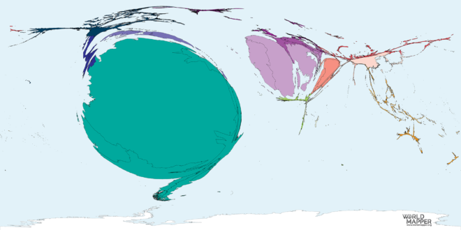
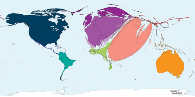
This map shows the countries of origin proportional to the number of people who were migrants to Russia in the period 1990 to 2017. Data sources This map uses data…

This map shows the countries of origin proportional to the number of people who were migrants from Russia in the period 1990 to 2017. The colour shading indicates the major…

This map shows the countries of destination proportional to the number of people who were migrants from Rwanda in the period 1990 to 2017. Data sources This map uses data…

This map shows the countries of origin proportional to the number of people who were migrants to San Marino in the period 1990 to 2017. Data sources This map uses…

This map shows the countries of origin proportional to the number of people who were migrants from San Marino in the period 1990 to 2017. Data sources This map uses…

This map shows the countries of origin proportional to the number of people who were migrants from Saudi Arabia. Data sources This map uses data United Nations Population Division, Department…

This map shows the countries of destination proportional to the number of people who were migrants from Senegal in the period 1990 to 2017. Data sources This map uses data…

This map shows the countries of origin proportional to the number of people who were migrants to Serbia in the period 1990 to 2017. Data sources This map uses data…

This map shows the countries of origin proportional to the number of people who were migrants from Serbia in the period 1990 to 2017. The colour shading indicates the major…

This map shows the countries of destination proportional to the number of people who were migrants from Singapore in the period 1990 to 2017. Data sources This map uses data…

This map shows the countries of origin proportional to the number of people who were migrants to Slovakia in the period 1990 to 2017. The colour shading indicates the major…

This map shows the countries of origin proportional to the number of people who were migrants from Slovakia in the period 1990 to 2017. Data sources This map uses data…

This map shows the countries of origin proportional to the number of people who were migrants to Slovenia in the period 1990 to 2017. Data sources This map uses data…

This map shows the countries of origin proportional to the number of people who were migrants from Slovenia in the period 1990 to 2017. Data sources This map uses data…

This map shows the countries of origin proportional to the number of people who were migrants to South Africa. Data sources This map uses data United Nations Population Division, Department…

This map shows the countries of origin proportional to the number of people who were migrants to South Korea in the period from 1990 to 2017. Data sources This map…

This map shows the countries of origin proportional to the number of people who were migrants from South Korea in the period from 1990 to 2017. Data sources This map…

This map shows the countries of origin proportional to the number of people who were migrants from South Sudan in the period 1990 to 2017. Data sources This map uses…

This map shows the countries of origin proportional to the number of people who were migrants from Spain in the period 1990 to 2017. The colour shading indicates the major…

This map shows the countries of origin proportional to the number of people who were migrants from South Africa. Data sources This map uses data United Nations Population Division, Department…

This map shows the countries of origin proportional to the number of people who were migrants to Sudan in the period 1990 to 2017. Data sources This map uses data…

This map shows the countries of origin proportional to the number of people who were migrants to Sudan in the period 1990 to 2017. Data sources This map uses data…

This map shows the countries of destination proportional to the number of people who were migrants from Suriname in the period 1990 to 2017. Data sources This map uses data…

This map shows the countries of destination proportional to the number of people who were migrants from Swaziland in the period 1990 to 2017. Data sources This map uses data…

This map shows the countries of origin proportional to the number of people who were migrants from Sweden in the period 1990 to 2017. Data sources This map uses data…

This map shows the countries of origin proportional to the number of people who were migrants to Sweden in the period 1990 to 2017. Data sources This map uses data…

This map shows the countries of origin proportional to the number of people who were migrants to Switzerland in the period 1990 to 2017. Data sources This map uses data…

This map shows the countries of origin proportional to the number of people who were migrants from Switzerland in the period 1990 to 2017. The colour shading indicates the major…

This map shows the countries of destination proportional to the number of people who were migrants from Tajikistan in the period 1990 to 2017. The colour shading indicates the major…

This map shows the countries of destination proportional to the number of people who were migrants from Tanzania in the period 1990 to 2017. Data sources This map uses data…

This map shows the countries of destination proportional to the number of people who were migrants from Thailand in the period 1990 to 2017. Data sources This map uses data…

This map shows the countries of destination proportional to the number of people who were migrants from Togo in the period 1990 to 2017. Data sources This map uses data…

This map shows the countries of destination proportional to the number of people who were migrants from Tunisia in the period 1990 to 2017. Data sources This map uses data…

This map shows the countries of destination proportional to the number of people who were migrants to Tunisia in the period 1990 to 2017. Data sources This map uses data…
This map shows the countries of origin proportional to the number of people who were migrants to Turkey. Data sources This map uses data United Nations Population Division, Department of…

This map shows the countries of origin proportional to the number of people who were migrants from Turkey. The colour shading indicates the major geographic regions of the world used…

This map shows the countries of destination proportional to the number of people who were migrants from Turkmenistan in the period 1990 to 2017. Data sources This map uses data…

This map shows the countries of destination proportional to the number of people who were migrants from Uganda in the period 1990 to 2017. Data sources This map uses data…

This map shows the countries of origin proportional to the number of people who were migrants to Ukraine in the period 1990 to 2017. Data sources This map uses data…

This map shows the countries of origin proportional to the number of people who were migrants from Ukraine in the period 1990 to 2017. The colour shading indicates the major…

This map shows the countries of destination proportional to the number of people who were migrants from United Arab Emirates in the period 1990 to 2017. The colour shading indicates…

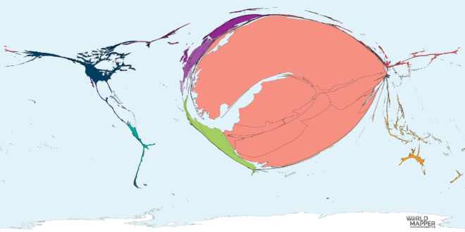
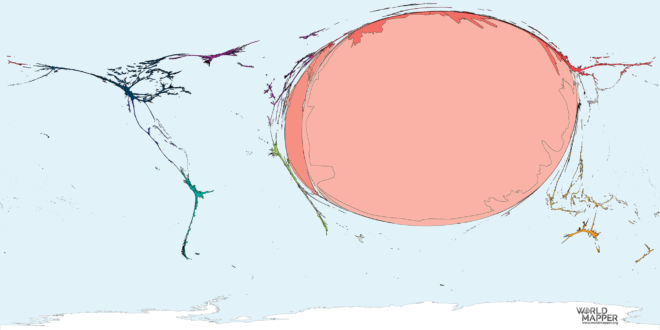
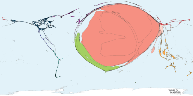
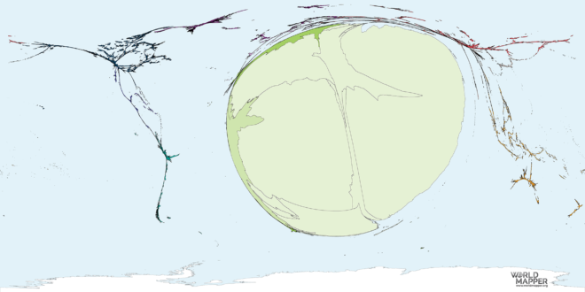
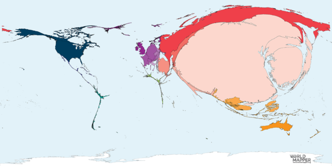
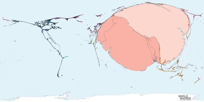
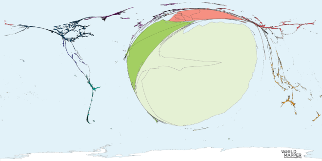
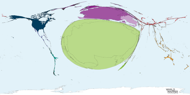
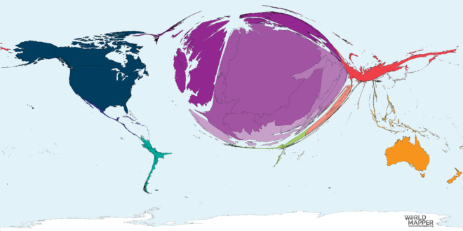
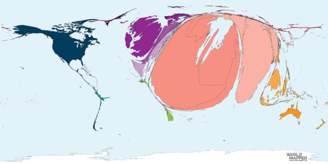
This map shows the countries of origin proportional to the number of people who were migrants to the United States of America in the period 1990 to 2017. Data sources…

This map shows the countries of origin proportional to the number of people who were migrants to the United States of America in the period 1990 to 2017. The colour…
This map shows the countries of destination proportional to the number of people who were migrants from Uruguay in the period 1990 to 2017. Data sources This map uses data…

This map shows the countries of destination proportional to the number of people who were migrants from Uzbekistan in the period 1990 to 2017. Data sources This map uses data…

This map shows the countries of destination proportional to the number of people who were migrants from Vietnam in the period 1990 to 2017. The colour shading indicates the major…

This map shows the countries of destination proportional to the number of people who were migrants from Zambia in the period 1990 to 2017. Data sources This map uses data…

This map shows the countries of destination proportional to the number of people who were migrants from Sierra Leone in the period 1990 to 2017. The colour shading indicates the…

This map shows the countries of destination proportional to the number of people who were migrants from Western Sahara in the period 1990 to 2017. The colour shading indicates the…

This map shows the countries of origin proportional to the number of people who were migrants from Malta in the period 1990 to 2017. Data sources This map uses data…
…well as cartograms exploring such topics as migration, language diversity and politics, power and poverty. The data was compiled and analysed by Worldmapper, an independent educational project, led by Benjamin…

…a selection of our language map series via an interactive map of our entire migration maps to maps providing an understanding of humanity’s place in the natural environment. Don’t miss…